You might
also enjoy...
How to Create Beautiful Color Palettes for Junk Journals, Scrapbooking & Paper Crafts
Learn How to Choose 3–5 Coordinating Colors for Beautiful Junk Journals, Scrapbook Pages & Paper Crafts — Plus Grab Your FREE Printable Color Swatches!
Disclaimer: Please note that some of the links in this post may be affiliate links or ads. There is no additional cost to you, but The Scrap Room will earn a small commission should you choose to purchase through those links. Click here for my full disclaimer. Thank you for your support.
Start With One Color You Love
The easiest way to create a beautiful color palette is to start with something that inspires you.
Maybe it's the dusty pink roses on a piece of vintage scrapbook paper, the soft sage green in a cottagecore floral design, or a gorgeous muted blue on a printable journal page.
Choose one color you absolutely love. That's your starting point!
Now look for two other colors that complement it. You might try dusty rose with sage green and warm ivory, or powder blue with soft lavender and antique cream.
You don't have to make this complicated. Sometimes the prettiest color combinations are the simplest!
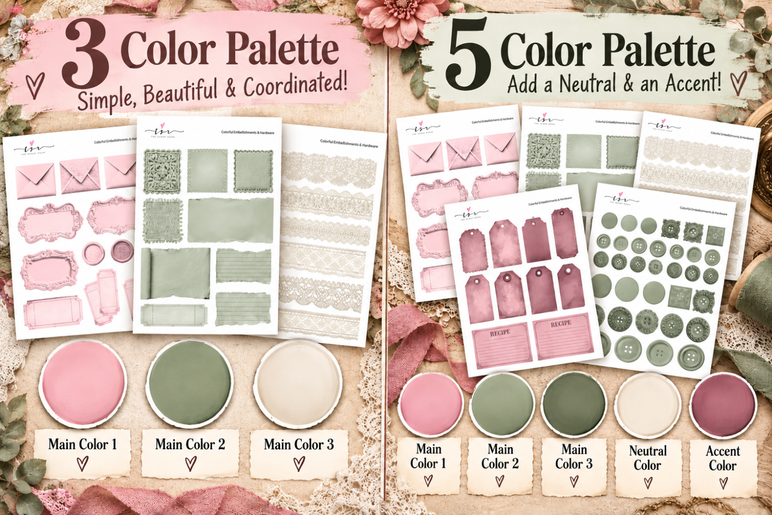
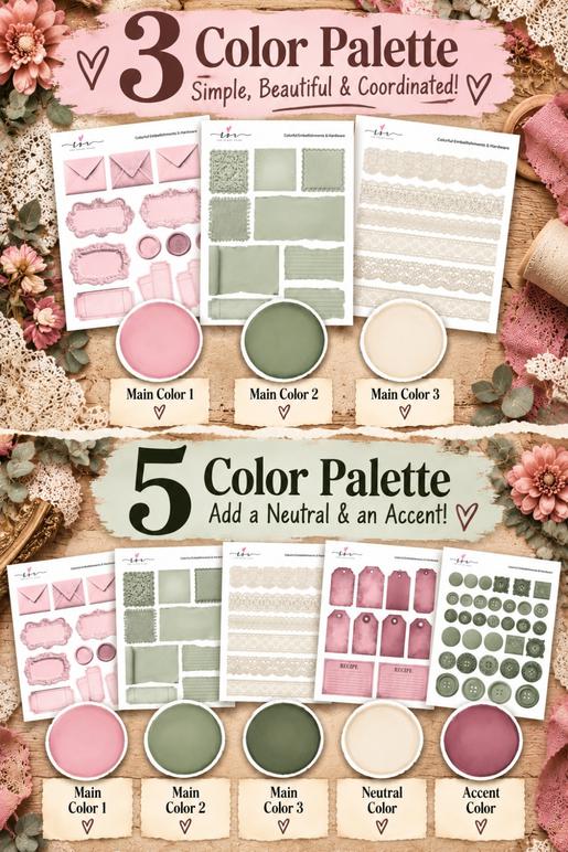
My favorite method is to choose 3 main colors, then add a neutral and an accent color.
Your three main colors create the overall look and feel of your project. The neutral helps tie everything together, while your accent color adds a little pop of contrast and interest!
For example, a romantic vintage junk journal might use dusty pink, sage green, and soft lavender as its three main colors, warm ivory as its neutral, and deep burgundy as its accent.
You don't have to use every color equally, either! Let one color be the star, use the others to support it, and sprinkle your accent color into smaller details like tags, labels, pockets, and embellishment clusters.
Have you ever found a gorgeous piece of scrapbook paper, a pretty vintage floral design, or a beautiful printable embellishment and wondered, what colors would look good with this?
One of my favorite tricks for creating beautiful, coordinated paper crafts is to start with a simple 3–5 color palette. It makes choosing your printable papers, tags, pockets, ephemera, and embellishments SO much easier!
And the best part? You don't need to know anything about color theory or have a natural talent for matching colors.
Whether you're creating a vintage-inspired junk journal, a romantic floral scrapbook page, handmade greeting cards, or colorful embellishment clusters, I'll show you how easy it is to choose colors that look beautiful together.
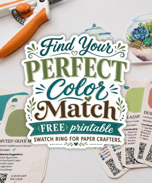
I've even got a FREE Printable Color Swatch Ring and a handy one-page Color Guide to make the whole process easier!




Find Your Perfect Colors With My FREE Printable Color Swatch Ring!
This is where things get really fun!
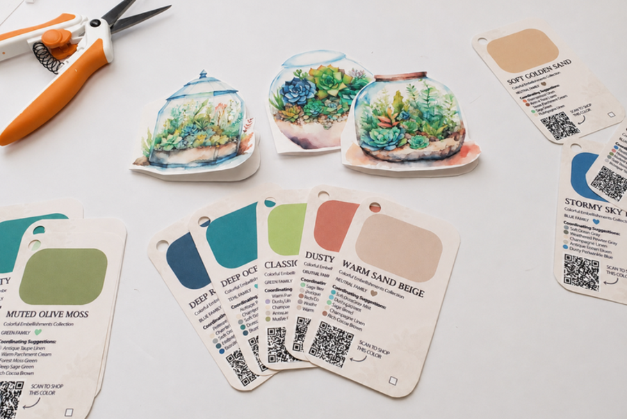
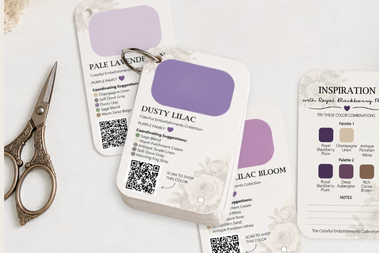
I created a FREE Printable Color Swatch Ring featuring 107 beautiful colors from my Colorful Embellishments Collection, and it's one of my favorite tools for planning coordinated paper craft projects.
Instead of trying to remember which colors go together, you can flip through your swatches, hold different colors next to each other, and discover beautiful combinations for your next junk journal, scrapbook layout, or handmade card.
Each swatch includes coordinating color suggestions and two ready-made palette ideas, so you don't even have to start from scratch!
There are also spaces for notes, checkboxes to track the colors you've collected, and handy QR codes to help you find coordinating printable products.
And here's a little bonus! Once you sign up, you'll also find my FREE One-Page Color Guide available as an instant download right on the confirmation page.
I love having both options available. The swatch ring is wonderful for flipping through individual colors and comparing combinations, while the one-page guide makes it easy to see lots of beautiful shades at a glance.
How to Print Your Color Swatch Ring on Cardstock
I recommend printing your color swatches on sturdy cardstock so they'll hold up to lots of flipping, comparing, and crafting. If you use the same cardstock you usually print your embellishments on, you'll get a more accurate representation of how your embellishments will look.
But if you've ever tried printing double-sided on heavy cardstock, you probably know that some printers aren't particularly cooperative! Automatic double-sided printing can cause jams, especially with thicker paper.
Fortunately, there's a little workaround you can try.
Instead of using your printer's automatic double-sided setting, print the pages manually.
First, print the even-numbered pages on one side of your cardstock. Keep the printed sheets in order as they come out of your printer.
Next, queue up the odd-numbered pages, skipping the introductory page 1, and place your printed sheets back into the printer tray so the matching pages print on the reverse sides.
The trick is figuring out how your particular printer feeds and flips the paper. Some printers need the printed side facing up, while others need it facing down. You may also need to reverse the order of your pages.
Please test this with one or two sheets before printing the whole collection! Make sure the correct swatches line up on the front and back, and that nothing is upside down.
Once you've figured out the right orientation, you can print the rest of your swatches, cut them out, punch a hole in each one, and add them to a binder ring.
If your printer doesn't handle double-sided cardstock well, you can always print the sides separately and attach them together instead.
Either way, you'll end up with a beautiful little color library you can keep right alongside your favorite craft supplies!
Why Your Printer Settings Matter More Than You Think
Here's something that can make a BIG difference when you're working with printable digital papers and embellishments.
The colors you see on your computer screen won't always look exactly the same when you print them.
Your printer, ink, paper, and print settings can all affect how colors appear.
For example, a soft dusty rose might look warmer on cream cardstock, while a pale lavender might look brighter on smooth white paper. Even switching from standard to high-quality printing can change the results.
That's why I recommend making a little note of your favorite print settings when you create your color swatch ring.
Write down which cardstock you used, the paper weight and finish, your printer's paper-type setting, and whether you printed using standard or high-quality mode.
If you regularly use different types of paper, you might even want to print a few sample swatches on each one and record the settings you like best.
Then, when you're ready to print coordinating embellishments, ephemera, or digital papers, you can use the same paper and printer settings to help reproduce the colors you loved on your swatches.
It's such a simple little habit, but it can save you a lot of frustration, wasted ink, and cardstock later!
How to Create a Coordinated Junk Journal Color Palette
Now let's put those pretty colors to work!
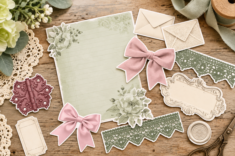
Imagine you've found a gorgeous vintage floral scrapbook paper with dusty pink roses, muted sage green leaves, and a soft ivory background.
You already have the beginning of a beautiful color palette!
Grab your printable swatch ring or one-page color guide and find shades that resemble the colors in your paper.
Start with dusty pink, add sage green, and choose a warm ivory or beige to tie everything together.
That's your three-color palette!
Want to make it a little more interesting? Add a deeper burgundy and a touch of antique gold for a romantic five-color combination.
Now you have a complete color scheme you can use throughout your project.
You might choose ivory and pink printable journal pages, sage green pockets, dusty rose tags, and little burgundy or golden embellishments to add contrast.
Even if the individual designs are different, repeating those same colors throughout your project helps everything feel like it belongs together.
And here's another little trick: you don't have to use every color equally.
Try using your favorite color for the largest areas, your second and third colors for supporting papers and embellishments, and your accent colors sparingly.
This helps keep your project from feeling too busy while still giving you plenty of room to be creative.


More Beautiful Color Palette Ideas for Paper Crafts
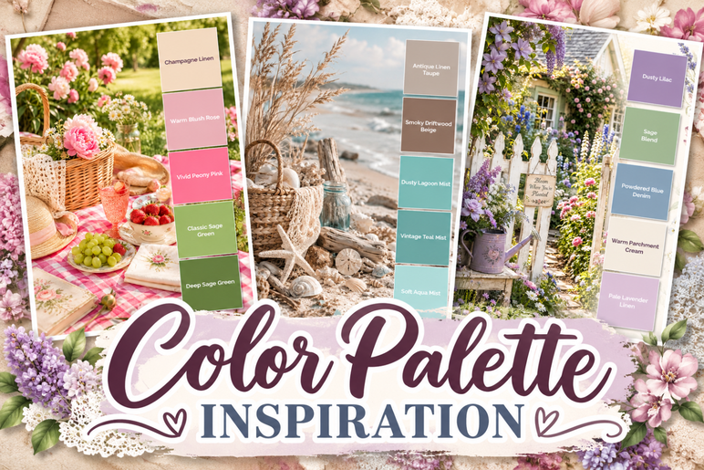
Once you start playing with color combinations, you'll discover just how much they can change the feeling of a project! Here are a few of my favorite ideas using colors from my Colorful Embellishments Collection.
For a romantic, shabby chic junk journal, try Sugar Blush, Vintage Dusty Rose, and Soft Lavender Mist, with Soft Ivory Cream as your neutral and Deep Rose Mauve as your accent.
Love cottagecore paper crafts? Combine Vintage Sage Mist, Warm Peach Blush, and Pale Primrose, with Vanilla Frost as your neutral and Forest Moss Green as your accent.
For a vintage-inspired scrapbook page, try Powdered Blue Mist, Muted Rose Blush, and Smoky Driftwood Beige, with Antique Porcelain White as your neutral and Muted Antique Mustard as your accent.
Prefer bold, colorful paper crafts? Mix Deep Ocean Teal, Raspberry Sorbet, and Golden Glow, with Warm Parchment Cream as your neutral and Sugar Plum as your accent.
You can also build an entire color palette around a favorite scrapbook paper, printable embellishment, ribbon, or photograph. Just grab your Color Swatch Ring and start experimenting!
There are no strict rules. Choose colors you love, have fun mixing and matching, and watch how repeating those colors brings your whole project together!
Love these color combinations? You can find all of these beautiful shades (and plenty more!) in my Colorful Embellishments Collection, with coordinating printable papers, ephemera, and embellishments to mix and match for your next project. [Browse All the Colors in My Etsy Shop!]
Find Coordinating Printable Papers, Ephemera & Embellishments
Once you've chosen your favorite color combination, it's time to gather your supplies!
One of the things I love most about my Colorful Embellishments Collection is that you can choose the exact colors you want for your project.
Each individual color kit includes 30 printable pages: 6 distressed digital papers and 24 pages of coordinating embellishments and ephemera.
That makes it easy to create your own collection of printable papers, tags, pockets, labels, and other decorative elements in the colors you've chosen.
Instead of hunting through dozens of unrelated designs and hoping they'll match, you can build a coordinated collection around your own favorite color palette.
And remember those QR codes on your printable color swatches?
Simply scan the QR code on a swatch to search for that color in my shop and explore the coordinating printable products available.
Of course, your swatches are just as useful for the craft supplies you already own!
Try holding them next to your favorite scrapbook papers, fabric scraps, ribbons, washi tape, stickers, or vintage ephemera. You might discover beautiful color combinations you never would have thought to try.
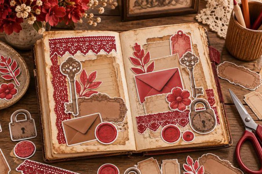
Your Next Beautiful Paper Craft Project Starts With Just 3 Colors!
Creating beautiful, coordinated junk journals, scrapbook pages, handmade cards, and paper craft projects doesn't have to be complicated.
Start with one color you love, choose two coordinating colors, and add a neutral and an accent color if you want a little extra variety.
Then repeat those colors throughout your printable papers, ephemera, tags, pockets, and embellishments to bring everything together.
And once you've made your own printable color swatch ring, you'll have a handy little color library ready to inspire all kinds of future projects!
Happy crafting!